Project Overview
How might we create a loyalty program that rewards occasional flyers while keeping frequent travelers engaged?
JetBlue's beloved TrueBlue program was losing ground to competitors, leaving both infrequent and frequent flyers feeling unrewarded. I led the UX redesign of their loyalty experience, creating a more inclusive program that serves diverse traveler needs.
My Role: Lead UX Designer | Team: 3 people (1 Visual Designers, 1 UX Designer, 1 PM) | Timeline: 11 months (2021) | Platform: Responsive Web
Context & Challenge
Business Background
JetBlue needed to overhaul their loyalty program in response to shifting customer behavior during the pandemic. While TrueBlue was once unique in the market, competitors had caught up with stronger offerings, and JetBlue was losing customer engagement.
User Problems
Infrequent Flyers (1-2 times/year):
Felt locked out of meaningful benefits due to high earning thresholds
Understood they'd never unlock travel rewards with their flying frequency
Saw loyalty program as irrelevant to their needs
Business Travelers:
Quickly maxed out top-tier Mosaic status
Lost incentive to remain loyal once benefits were achieved
Frequently chose competitor airlines after reaching elite status
All Users:
Lack of personalization made benefits feel generic
Travel rewards felt like standard service rather than special perks
Unclear value proposition compared to competitors
Project Constraints
Had to work within existing JetBlue.com architecture
Mobile-first approach required (60%+ of users accessed accounts on mobile)
Needed to protect existing Mosaic elite tier while expanding base program
Process & Approach
Discovery Phase
Stakeholder Interviews: Conducted sessions with business stakeholders to understand program goals and constraints
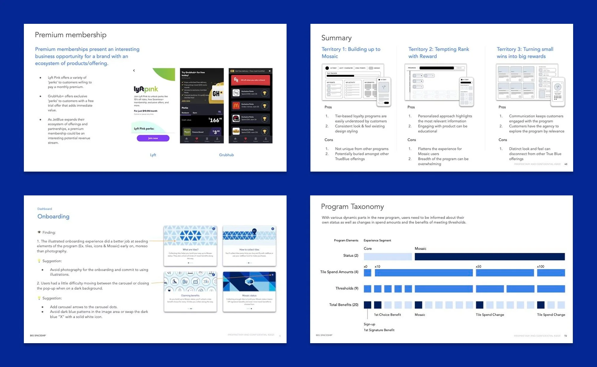
Competitive Analysis: Audited loyalty programs both within aviation and across industries to identify successful patterns and opportunities
Provisional Personas: Created user archetypes to represent the diverse needs of JetBlue's loyalty base
Key Insights
Hierarchy Mattered: Users needed clear visual distinction between basic and elite experiences
Progress Visibility: Travelers wanted to understand exactly what they needed to reach next benefit level
Digestible Information: Complex program rules needed to be broken into small, understandable chunks
Mobile Context: Users frequently checked accounts while traveling, requiring thumb-friendly interactions
Solution Deep-Dive
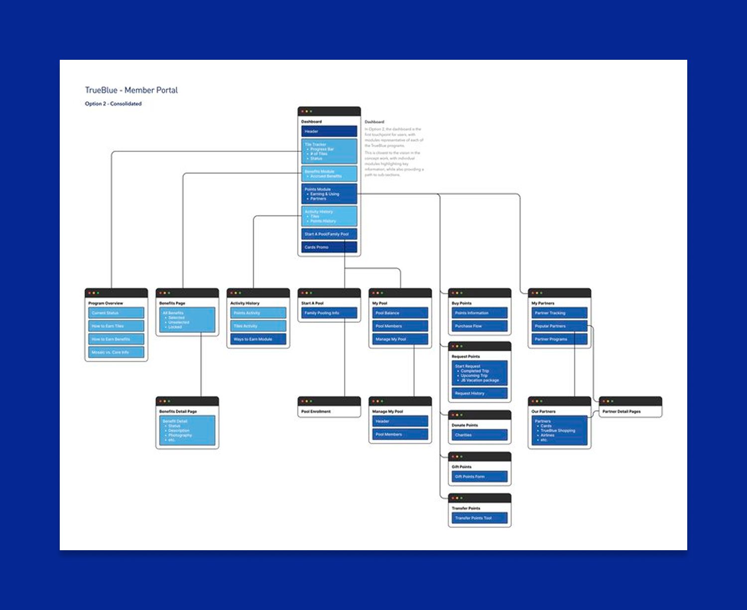
Information Architecture
I restructured the account section to accommodate new program elements while simplifying navigation.
Key decisions included:
Consolidating secondary pages to focus on core user tasks
Creating clear content hierarchy with benefits prominently featured
Designing flexible modules that could adapt to different user status levels
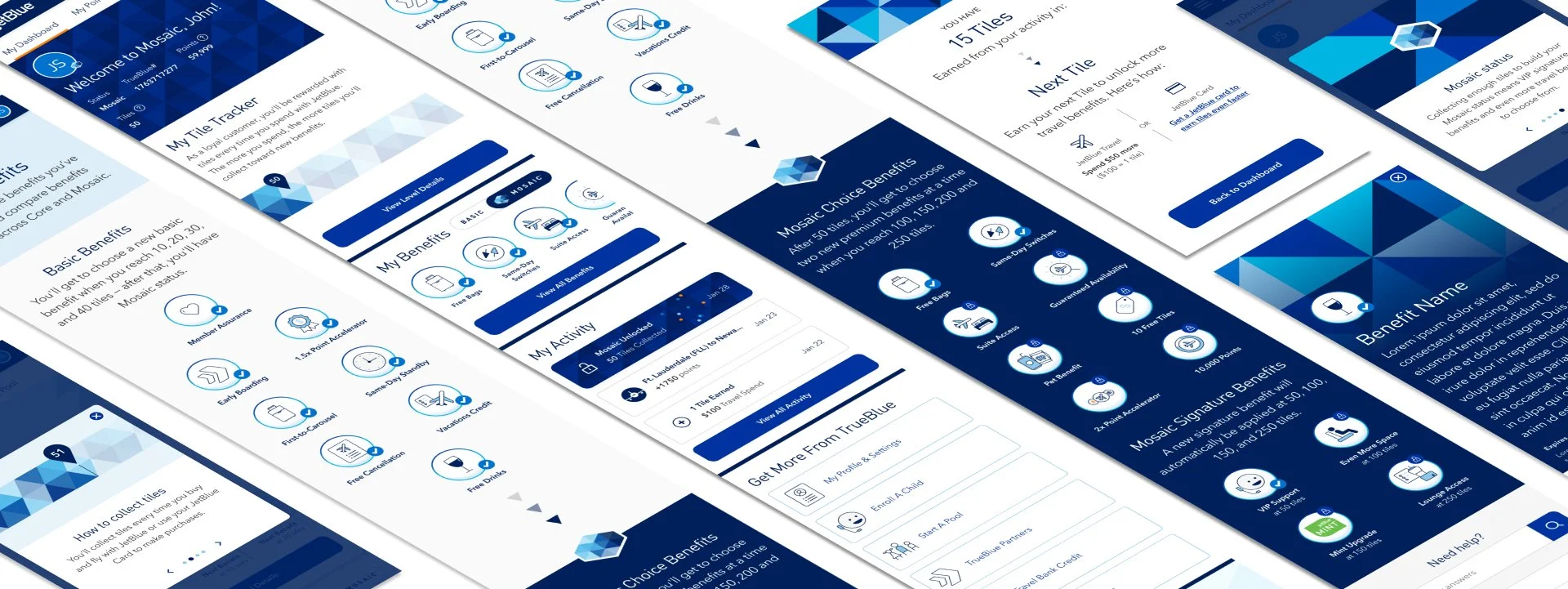
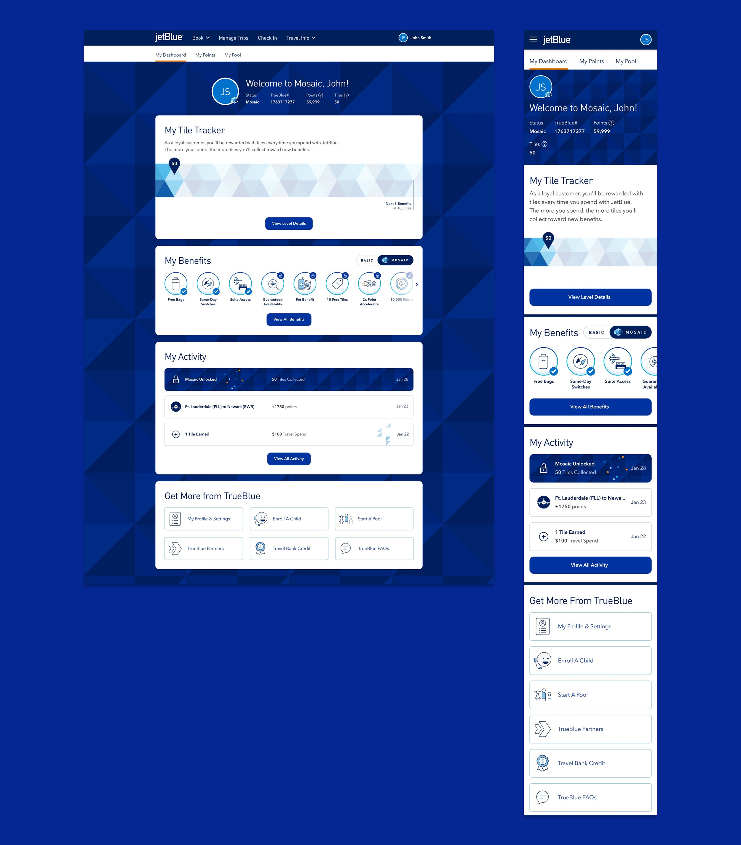
Dashboard
Problem: Previous dashboard was cluttered and didn't highlight loyalty benefits.
Solution: Card-based layout that parsed information clearly
Simplified navigation focused on core user needs
Elevated key account information and active benefits
Created scannable layout that worked across device sizes
Explorations
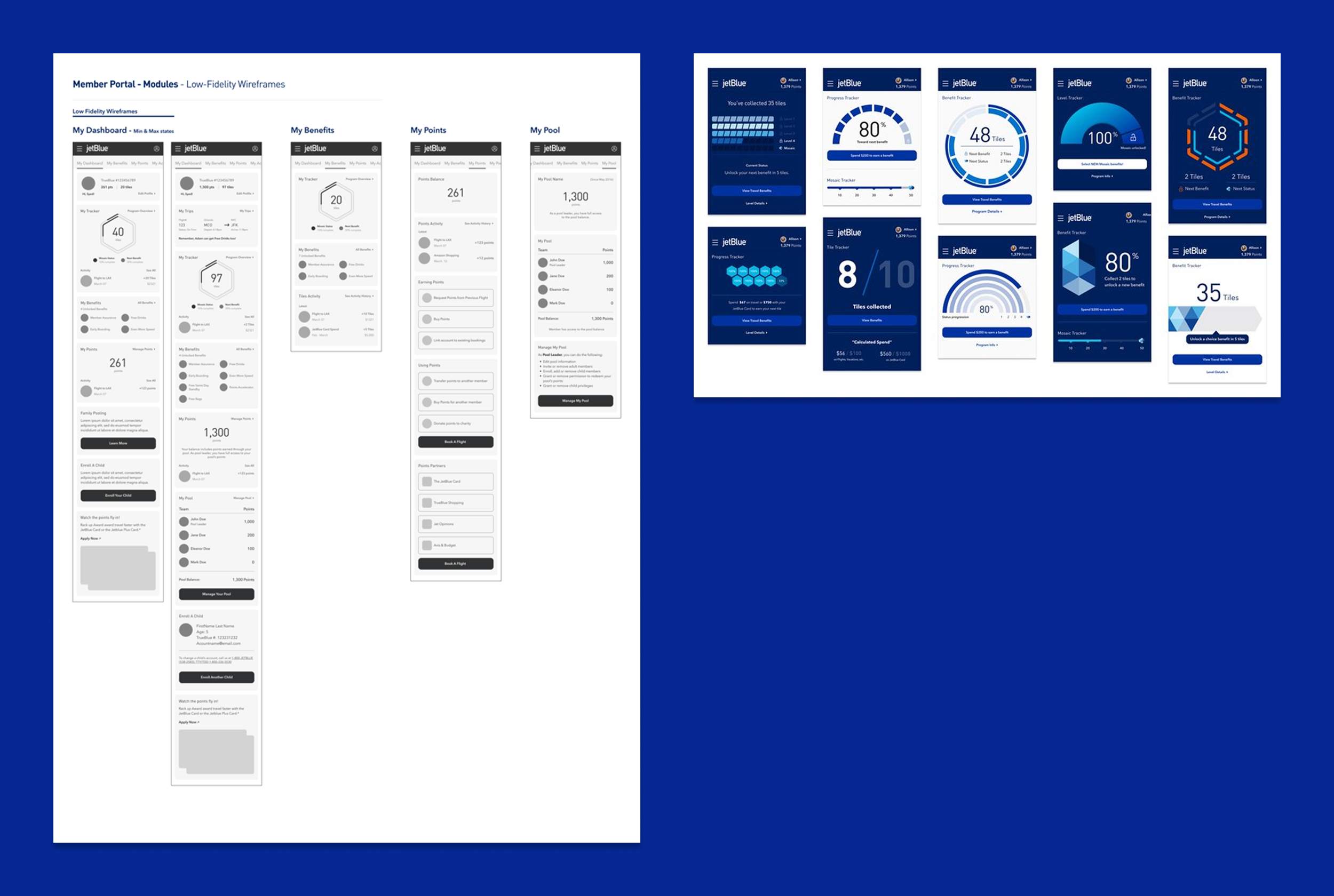
Dashboard Designs
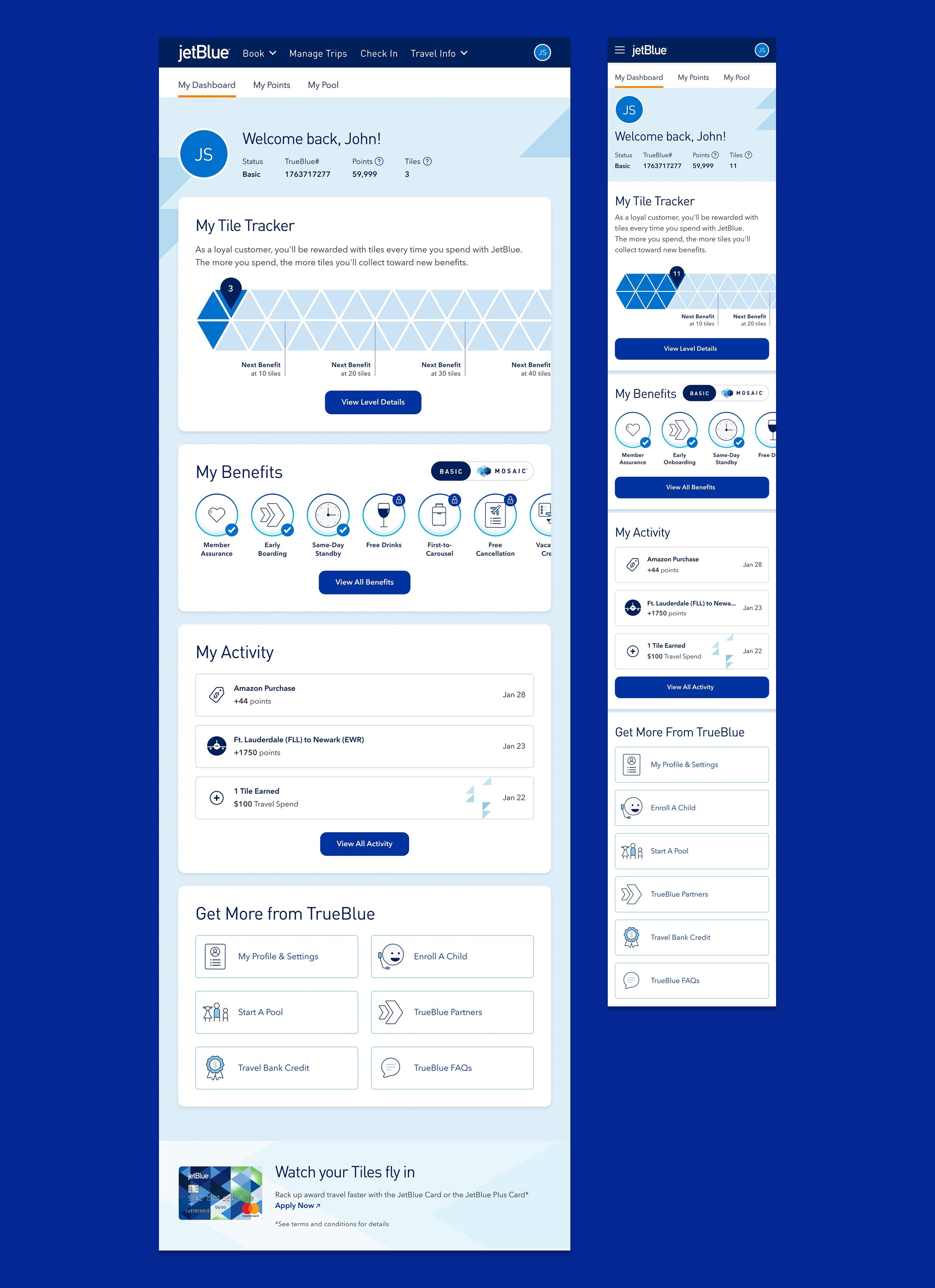
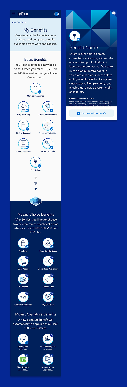
Benefits Experience
Problem: Users didn't understand program value or how to earn rewards
Solution: Educational approach with clear progression indicators
Benefits laid out to both interest and educate users
Dynamic content served information in digestible chunks
Clear dollar amounts showed exactly what users needed to earn next benefit
Simple language explained complex travel benefit details
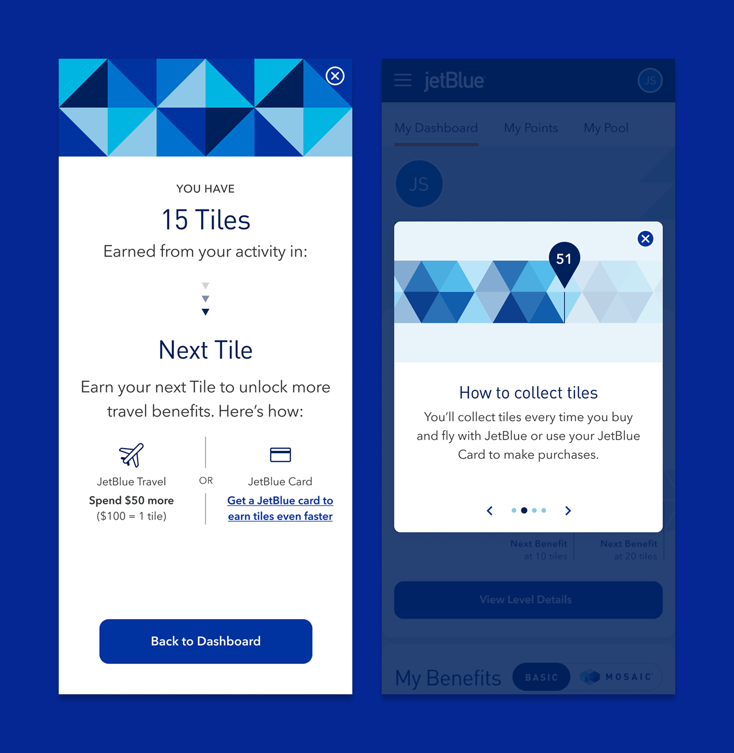
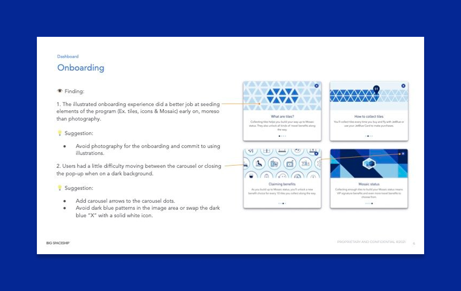
Onboarding & Education
Problem: Program changes needed to be communicated without overwhelming users
Solution: Contextual education delivered through progressive disclosure
Pop-up system introduced new features gradually
Onboarding flow educated users about program changes
In-context help explained complex concepts when relevant
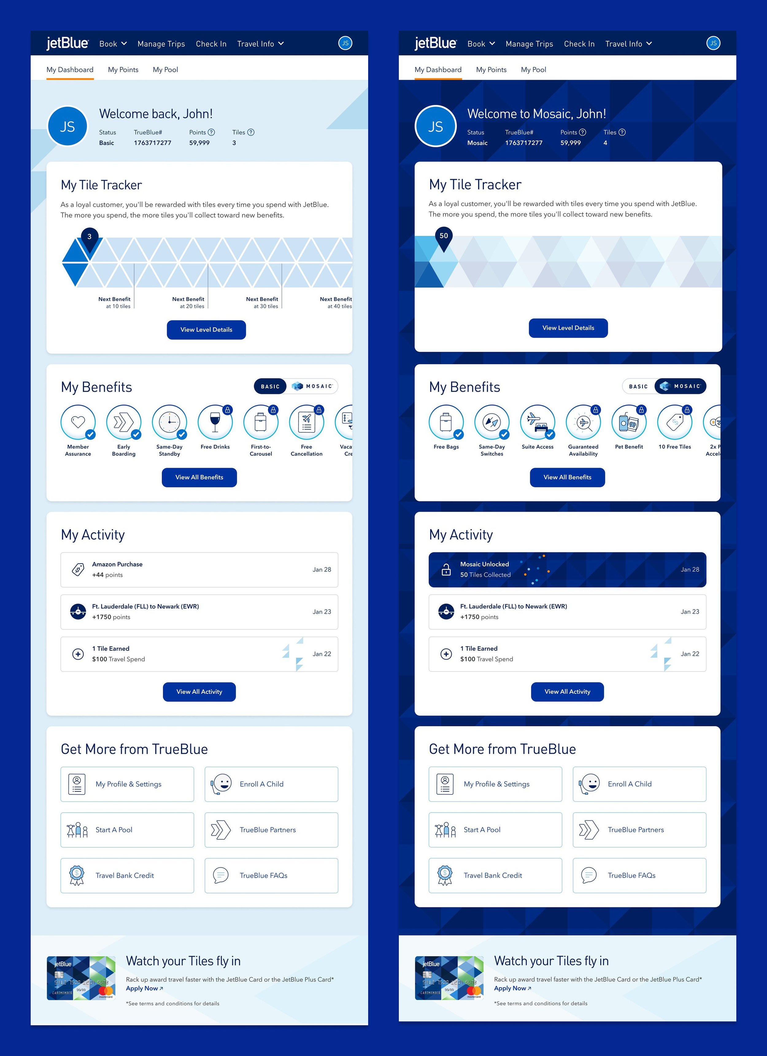
Mosaic Differentiation
Problem: Elite users needed to feel special recognition for their status
Solution: Distinct visual branding system for Mosaic tier
Unique color palette and visual elements for elite experience
Consistent branding applied across large and small interface elements
Clear status indicators that reinforced premium feeling
Responsive Design Strategy
With mobile usage dominating, I prioritized thumb-friendly interactions and optimized information density for smaller screens while maintaining full functionality across devices.
Impact
Results
Significantly improved task completion rates for benefit discovery
Users demonstrated better understanding of program value proposition
Mobile usability testing showed enhanced navigation efficiency
Business stakeholders expressed strong enthusiasm for the new direction
Created reusable components adopted across other JetBlue digital properties
Successfully balanced needs of diverse user groups while delivering on time and within scope
Reflection
What Worked Well
Thorough discovery phase provided strong foundation for design decisions. Card-based layout effectively organized complex information, and mobile-first strategy aligned with actual usage patterns.
What I'd Do Differently
Would have pushed for more direct user interviews beyond stakeholder sessions and explored more radical departures from traditional loyalty program UX patterns.